They say, “Don’t judge a book by its cover.” But let’s face the truth: we all do. The first impression of a gadget matters, just like the first impression of a person.
When I first laid my eyes on the revolutionary iPhone 4, I was instantly in love with its simple yet edgy design. It was a design that shocked and redefined the phone industry. Even though the prototype was leaked two month prior to the announcement, Steve Jobs still managed to pull off an amazing keynote that impressed the world.
From the chic iMac and MacBook to the sleek iPhone and iPad, Apple’s simplistic style is currently imitated by many companies.
“It’s in Apple’s DNA that technology alone is not enough. It’s technology married with liberal arts, married with the humanities, that yields the results that make our hearts sing.”
Steve Jobs once said this during the announcement of iPad. I really admire this quote because I think your tech device should be treated as a piece of personal accessory, instead of just a gadget. Take your wallet or handbag for example. If your wallet and handbag are only designed for their functionalities, why don’t you just carry your stuff with a durable plastic bag?
The Good Design – iPhone
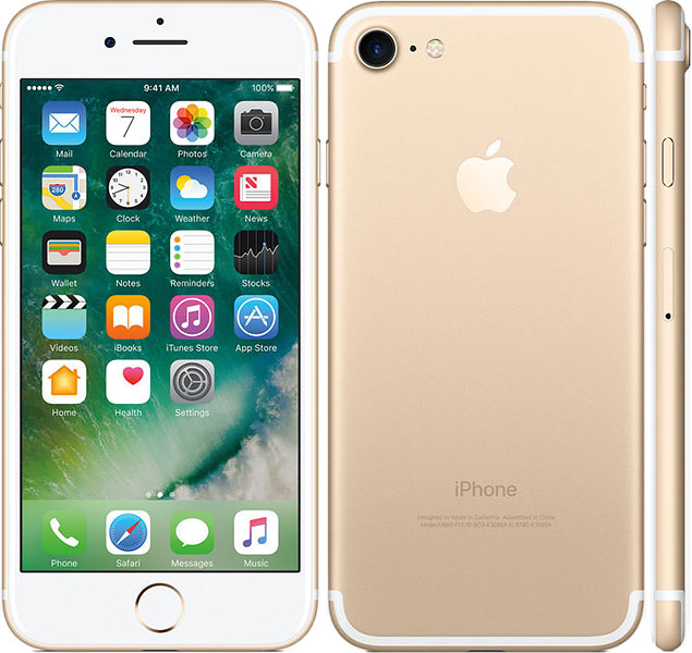
iPhone 7
I have high expectations of design when it comes to smartphones. I prefer smartphones that contain a minimalistic surface. What I mean by that is the phone should either have a symmetrical surface or a clean surface with all the necessary component.
Take the iPhone for example, the surface of device contains the home button, the multitouch screen, the speakerphone, the camera and the ambient light sensor. Each of them are harmoniously placed onto the surface with equal margins.
In my opinion, the surface of a touch-screen smartphone should contain only one button. The home button on the iPhone acts both as a “return to home” key and the fingerprint scanner known as Touch ID. Too much buttons on the surface is very redundant, it not only add asymmetry to the surface, it also duplicated the purpose.
There is also something we should take note when we look at the iPhone. You might not know that Apple is the pioneer of the rounded corner design. As a matter of fact,
Apple currently holds the patent for rounded edges. This forces other phone vendors to make phones that visually appear with rounded edges but mathematically inaccurate.
The back of the iPhone is also pretty clean. In order to have full aluminum back, Apple decided to move those signal cutouts to the side in order to make it visually pleasing.
The Bad Design – Pixel (and others)
Google Pixel
Many (by many I mean most Apple competitors) phone manufacturers have a horrible sense of component placement on their phone’s surface. All the components on their phone’s surface are placed randomly. It seems to me that they just want to crank everything within the narrow body of the phone.
Let’s just look at the latest Google Pixel. Pixel is a powerful phone and there’s no doubt about that. But please, do take a look at the surface of the phone. I mean, what the heck! Look at the placement of these components! What is that rectangular shaped object on the top? Look at that empty chin! You should never leave that much empty space on the phone! Spaces are precious, get that Google (or HTC)?
The back of the Pixel looks even worst. Why is there two distinctive colours on the back? I understand that a full aluminum enclosure will obstruct the signal but you don’t need to leave THAT much of a space on the top. Also, why are there three dots on the top?

HTC One A9
Speaking of HTC, I believe they are the company that designs some of the worst looking phone out in the market. Look at this phone, HTC A9 One, which apparently inspired Google Pixel. Look at their placement of camera and ambient light sensor. That ambient light sensor is not even on point! Was the designer drunk? It’s interesting to see that the back of both HTC A9 One and Google Pixel “borrows” signal cutouts from iPhone.
User Interface Design – The art of home screen
User interface design is one of the important factor to consider when designing a smartphone. I believe that there are two steps when interacting with a smartphone. It’s the moment you hold it up and the moment you use the system.
I personally prefer a very minimalistic user interface and that just automatically disqualify Android. Although I like widgets, I am strongly against leaving the widgets on my home screen because they are super messy. I think all widgets should categorize themselves into a special place make them easily accessible by a swipe of a finger. I also prefer my icons to have equal sizes and unified dimensions. Look at the unified icons on iOS and the irregular icons on Android. Although irregular icons are unique, they are visually less pleasing than their iOS counterpart.

Application Drawer
Now, Android has something that I really dislike and that would be the Android app drawer, which usually located on the dock. Pressing app drawer will bring you a fully list of Android applications in random order. Since all Android icons are different, looking at the unorganizable list is a total nightmare.
Click here for my thoughts on iOS and here for Android. Both articles are very technical :).
Final Thoughts
Smartphone designs are important to me. I have always viewed my smartphone like a designer wallet, even though smartphone will eventually replace them in the future. We are currently living in a world empowered by technology and we shouldn’t just settle with its original form. One might argue that the technical specifications are more important when it comes to technology. I just think that if it doesn’t look good, it’s not going to make me satisfied and it certainly not going to make my day easy.